And I think all of that is entirely deliberate!
I think Jonathan Yeo meant this portrait to be absolutely all of those things, he just can't be very vocal about the paintings true meaning. Yet.
I've done this on another post, but let's compare that portrait up there to some other portraits Yeo's done.
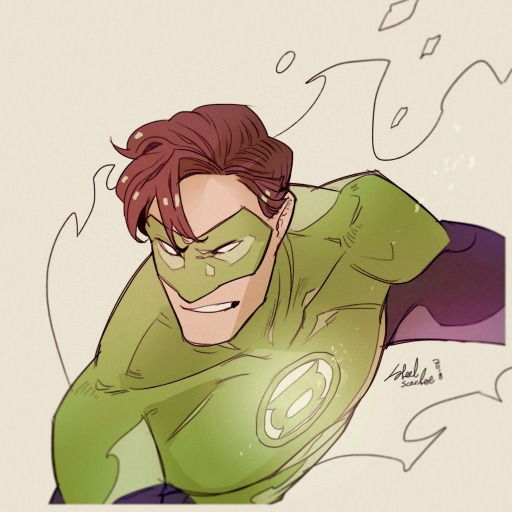
Here's actor and activist Idris Elba, whom colleagues have described as warm and friendly, open-hearted, with an emotional intelligence that makes him capable of being very honest and vulnerable with the character he's playing:
Here's Jony Ive - who founded Apple with Steve Jobs and was chief design officer responsible for some of the more popular artistic choices, who recently left the company because the culture had gotten so toxic and shitty. He now works more in private design, so he has more artistic freedom and he can be less in the public eye:
Yeo's even previously painted British heads of state. Here's the phenomenal Baroness Doreen Lawrence of the labour party, a Jamaican immigrant who turned the tragic murder of her son into a lifelong campaign of quietly and steadily dismantling systemic racism:
To me, all these portraits are deeply personal, conveying the sitter's character with empathy and quiet dignity.
Elba is leaning forward in an intimate friendly gesture. He makes eye contact with the viewer but his face is turned slightly to the side, inviting but not confrontational, his brows slightly drawn together thoughtfully. His hands are natural and relaxed. He's shirtless - not to be a beefcake thirst trap (okay maybe just a tiny little bit), but to convey how emotionally naked he's willing to be.
Ives is literally putting a lens between himself and the viewer - we have to look closer to see his face, but when we do we see his eyes crinkled with a hint of good humor. The perspectives are all distorted, but the main thing we see is the hands that have physically built so much of the technology we use. And even outside the phone screen he's still enased by a circular frame within a frame, indicating yet another layer of separation between the subject and the viewer.
Lawrence is radiant, proudly upright and implacable as a mountain, her head held high and her hands folded before her with a self-contained air of calm determination. And even though the background is a chaotic sea of looming shapes and quick brush strokes, her eyes keep us grounded, even pinned in place. We're the viewer, but she is studying us.
And then, on the other end of the personality spectrum, here's noted asshole Damien Hirst, who frequently makes the news for being racist and sexist and just generally a really slimy piece of shit. His most famous works are the animal carcasses suspended in resin-
-yeah, that. That guy. He's made all the money in the goddamn world three times over for pieces like that, and he still seems like he's on a personal mission to make everyone around him as miserable as possible.
Here's Yeo's portrait of him, seated on a leather throne, dick bulge at eye level, contained in one of his own tanks:
Here's the droopy and melancholic portrait of the famously pompous and insufferable John Cooper Clarke, self-described "original punk poet", who was recently booed off stage for making super transphobic remarks, and whose most famous quote is "I read Kerouac at 12 and decided I could do better":
And, most notably for the argument I'm making here, here's D-Day veteran Sgt Geoffrey Pattinson, and see if you can spot the extremely subtle use of color theory here:
My conclusion: Jonathan Yeo paints very good portraits, and sometimes his subjects are very bad people.
And I think he brings absolutely all of his artistic talent to the Charles portrait.
@chromegnomes is absolutely right; it is the only possible way to depict him. It is a photograph of his soul.
And that's precisely why it's so ugly and uncomfortable to look at.
People have said that Charles has a "complicated legacy", which is what people say when someone has an objectively horrible legacy that they are still personally benefiting from. But the people who still tolerate his extravagant gilded existence to "honor historical tradition" will find absolutely nothing to like in this portrait. All the gold and brass and pomp of his uniform, all the military accolades for his colonial warmongering, all the fabulous ostentatious wealth he was born into and has spent every second of his life surrounded by - which would have been rendered with glittering precision and care in a traditional royal portrait - they're all dingy and washed out and already fading. The medals aren't even clearly marked enough to really know what they are; it's all sound and fury, signifying nothing.
The butterfly that was included as a nod to his honestly extensive conservation work (because let's give the little bit of credit where credit is actually due) stands out as the one bright point of beauty and authenticity - but it's dwarfed by the only other visible object, the sword, and it's being swallowed up by that lurid, putrid background that seems to seep out of Charles' uniform. The dark tips of its wings are the most high-contrast part of the painting except for Charles' black hollow eyes that stare into nothing. And, most significantly in my opinion, the butterfly isn't actually touching him, or connected to him in any way. It just exists alongside him, but it doesn't need him.
His face is painted in such a way to detail absolutely every wrinkle without ever being able to completely cover up the blood red background, and below the sunken shark-like eyes, the artist has included that vapidly pleasant plastered-on smile with nothing behind it that is practically the royal uniform by now. I think the angle is also deliberately chosen to be unsettling: many portraits are traditionally done either head-on, 3/4 profile, or full profile. Charles is none of these - his head is tilted juuust a few degrees off kilter. It's not quite right. And he's looking off to the side very slightly; his thousand-yard-stare is kind of drifting over the viewers shoulder. He can't look us in the eye.
And there is no way, there is absolutely no possible way that an artist who is smart enough and skilled enough to imbue all his other portraits with so much meaning and symbolism and indicators of the subject's character - there's no way that's not intentional.
But... Yeo lives in London. He's still working on other royal and aristocratic portraits. He still has to live in that society, and he still has to get paid.
So of course he has to toe the line, at least until Charles dies, and say that the vivid blood-soaked red is to symbolize the """vibrancy""" of this terminally ill octogenarian, to bring a """modern contemporary feel""" to this 19th century colonizer.
Yeo knows exactly what he's doing.
The king saw the painting when it was about halfway done. Yeo tells BBC News’ Katie Razzall that Charles was “mildly surprised by the strong color, but otherwise he seemed to be smiling approvingly.” He adds that when Camilla saw the portrait, she said, “Yes, you’ve got him.”
Listen, I work in memory care and end-of-life care, and we only say someone "seems to be smiling approvingly" to comfort the family when someone is so far gone they clearly don't know where they are anymore. His ex-wife Camilla, who probably has more good reasons to hate him than any other single human being alive, looked at this haunting vision of hell and was like YES PERFECT.
This is all completely intentional. We are all picking up on exactly the message the artist was trying to convey. Yeo is trying to tell us, loud and clear, that something is not right here. It is absolutely an omen.
Op is right; it is insulting him. And it is supposed to make us look at this pathetic villain, who is currently toddling through the final days of his unfairly long and lavishly useless life, and think "these are our rulers?"