Take a look at the following collection of rectangles. Does any one of them stand out? Is there one your eye went to directly?
They are all blue, of course, but one is not the same blue as the rest. And I suspect that you spotted that right off.
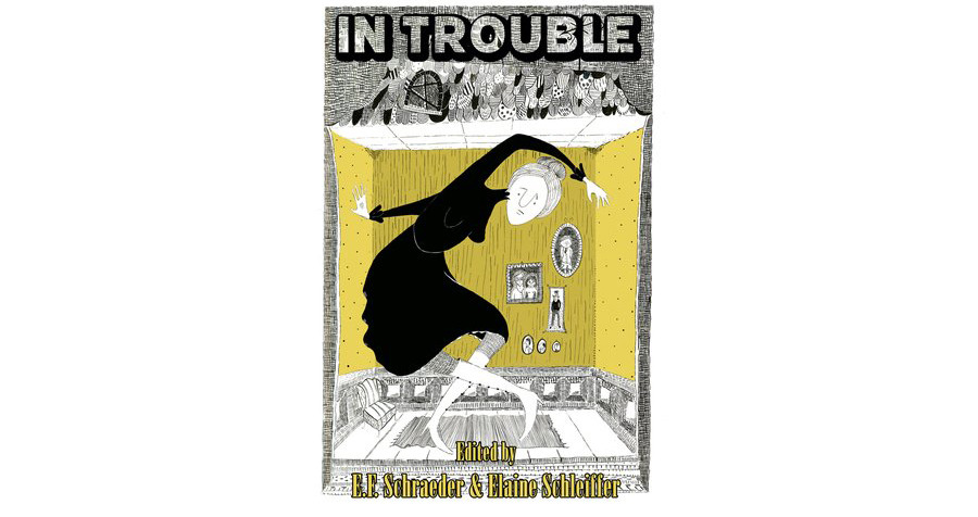
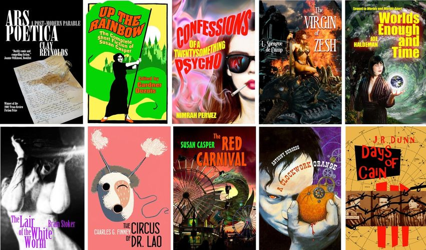
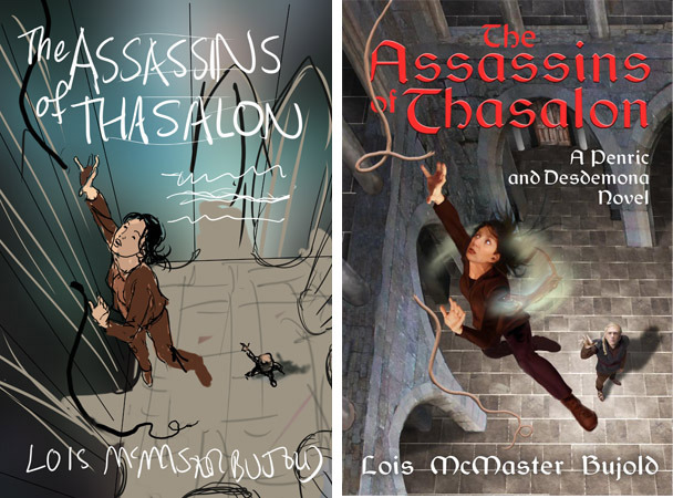
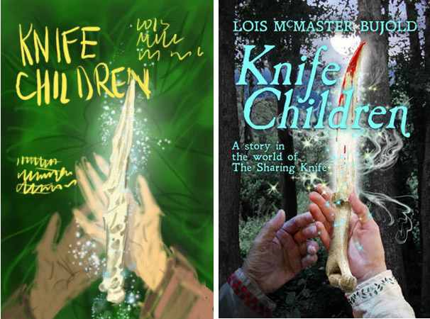
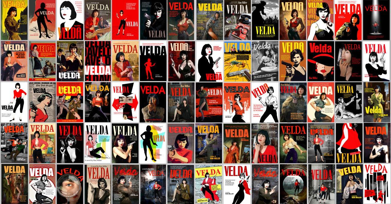
Far too many authors when commissioning a book cover—and far too many would-be designers for that matter—worry far too much about being “genre specific” or “on-market,” that is, making sure that their book cover looks as much as possible like other books in the same genre. The problem with this thinking is, of course, the danger of the book looking so much like every other book on the same page or shelf that there is no special reason for the potential reader to chose that book over any other one. There is nothing setting one book apart from another than the title. There is a not unreasonable fear, of course, of being too “different.” No one wants to be the one to introduce a new direction in cover design. Of course, every current style once had to have had a first cover. And the reason that style became the norm is because of that first cover’s success. Think of all the Star Wars clones that followed the original movie. Cozy mysteries, for instance, and romantic comedies didn’t always look the way they do now. But it’s not really necessary to be the vanguard of an entirely new style. All that’s necessary is to, first, inform the potential reader what sort of book you have then give them a reason to pick up your book instead of the one next to it. You can follow a trend without being so slavish that your cover is little more than a rubber stamp. It just needs to look that little bit more different, that little bit more intriguing than the cover next to it.
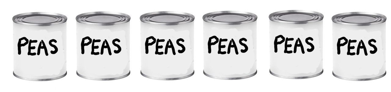
Think of all of the products sitting on the same shelf in a supermarket. That’s all that a book cover is: packaging. It’s really no different than the label on a can of peas. When you scan across all the different brands of peas in the grocery, there is a necessary sameness: the labels are all trying to sell a similar product. But at the same time they are also trying very hard to make you pick up one particular brand. There’s a good reason that all of the labels don’t just have the word “peas” on them and nothing else regardless of the brand.
All of the rectangles are blue—but one is a different blue. That’s the one your eye went to and that is exactly the point. It didn’t have to be red or green or plaid, just a little different.